Workshop results: Dance Photography
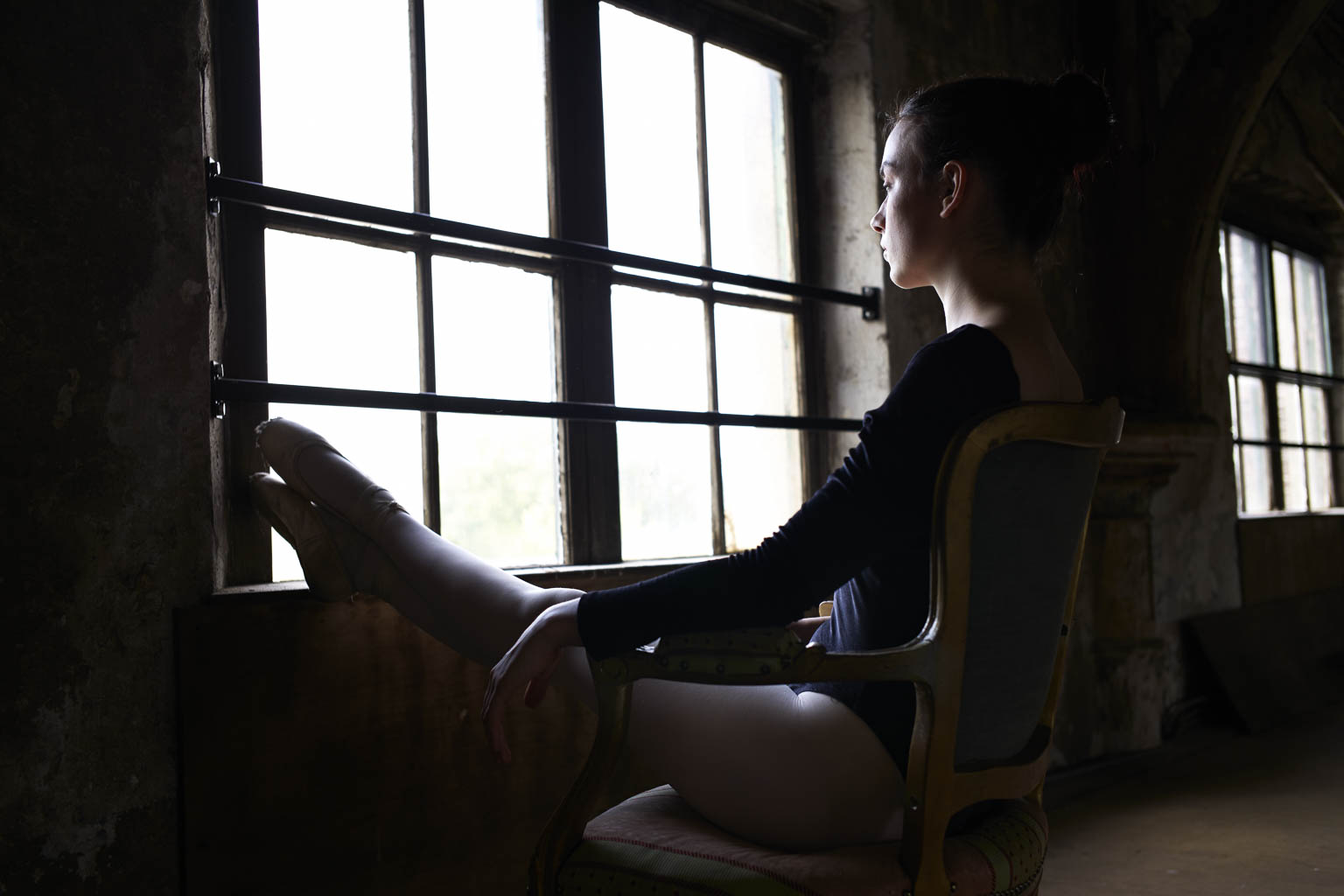
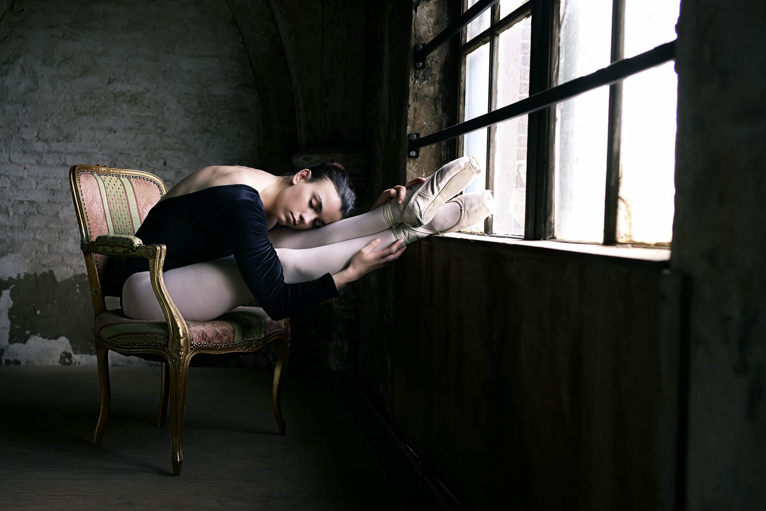
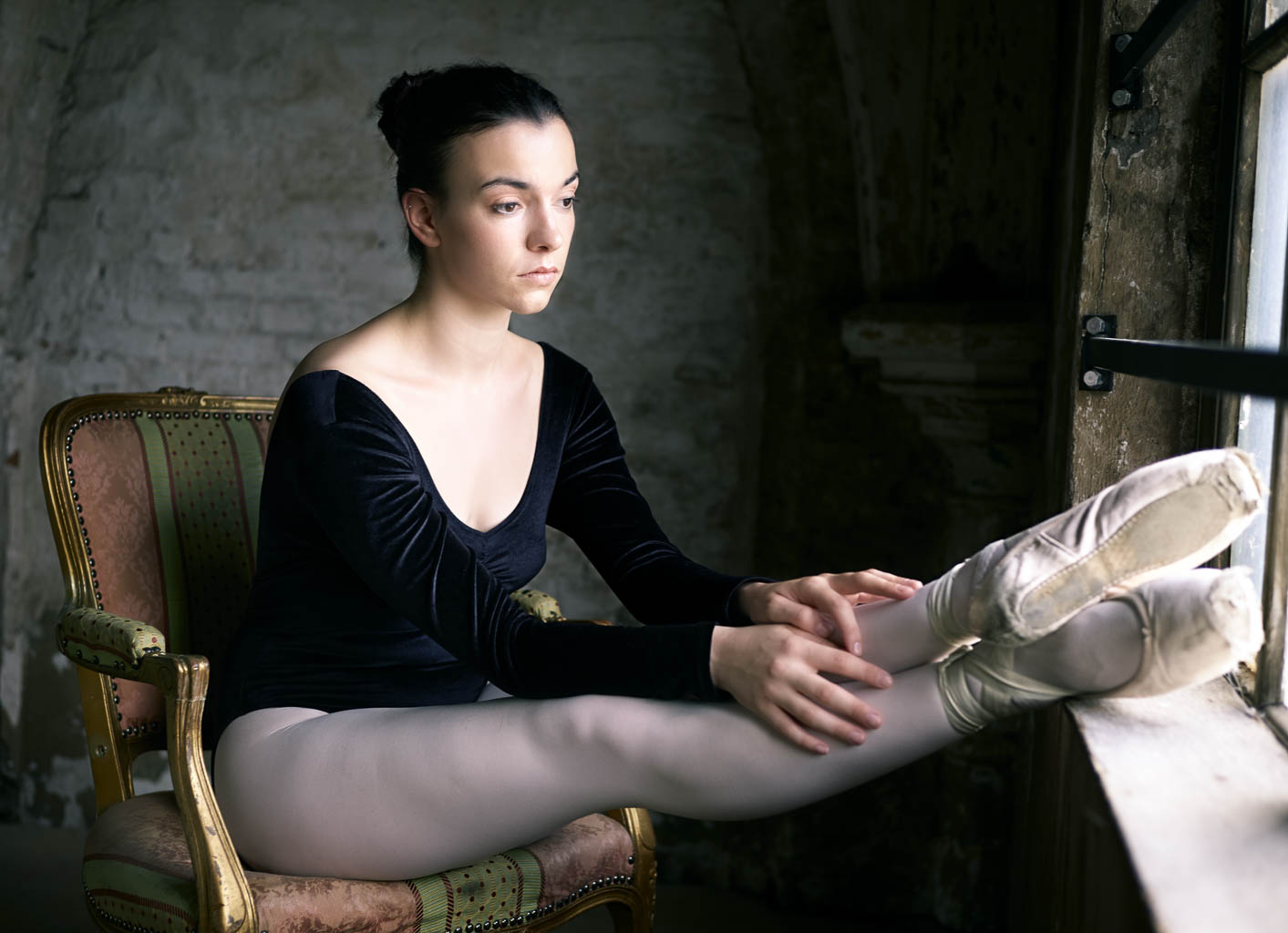
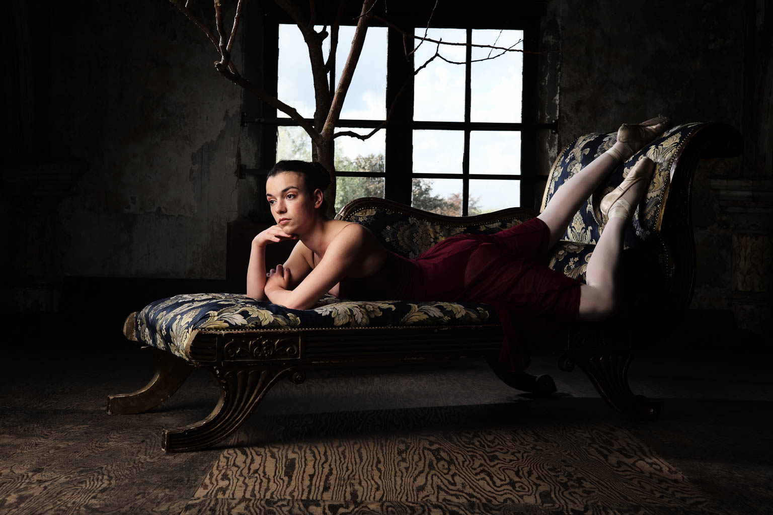
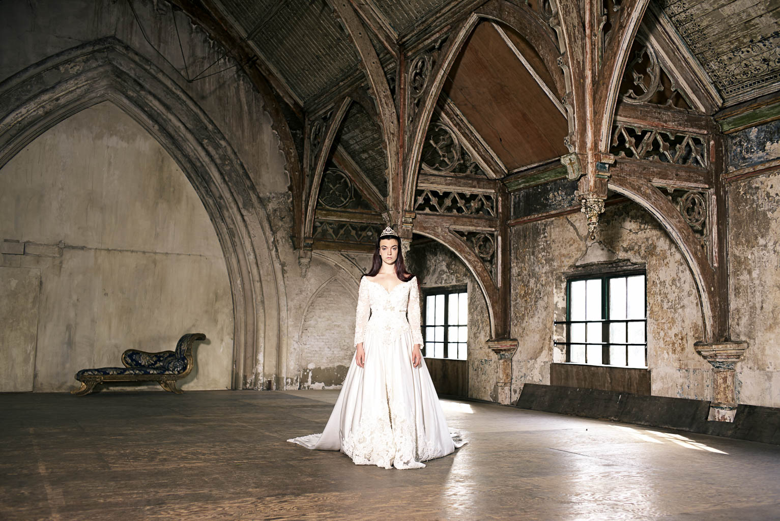
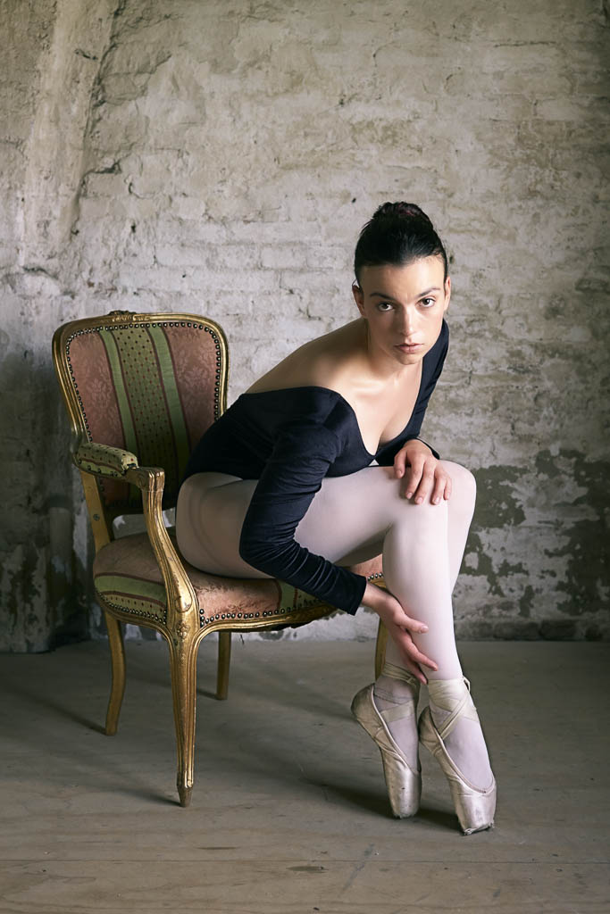
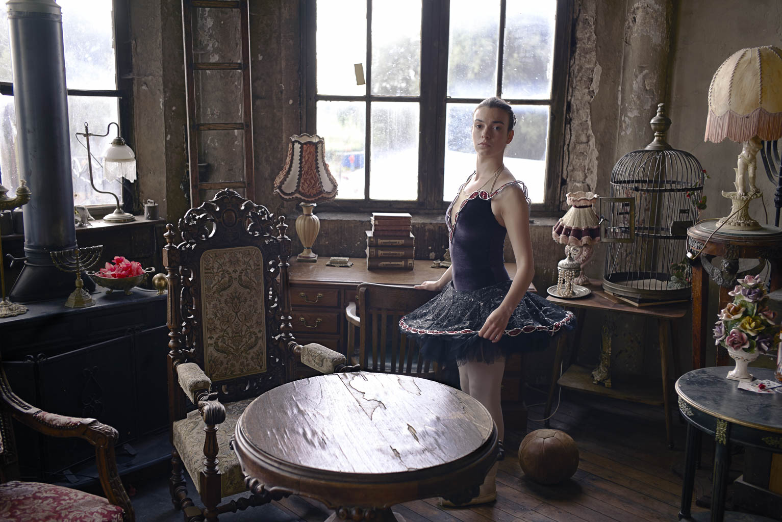
Past weekend I gave two workshops. Here are the results of the workshop of Saturday, the workshop Dance photography. We started off with a couple of portraits of the dancers and then made a few real action dance photo's
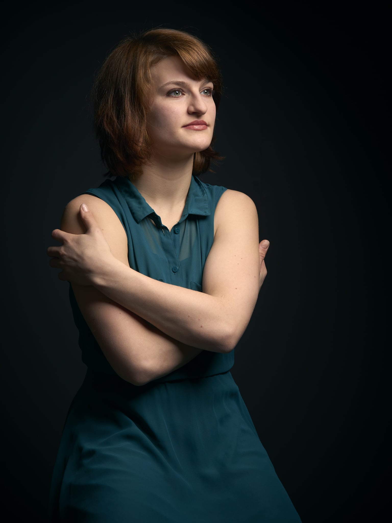
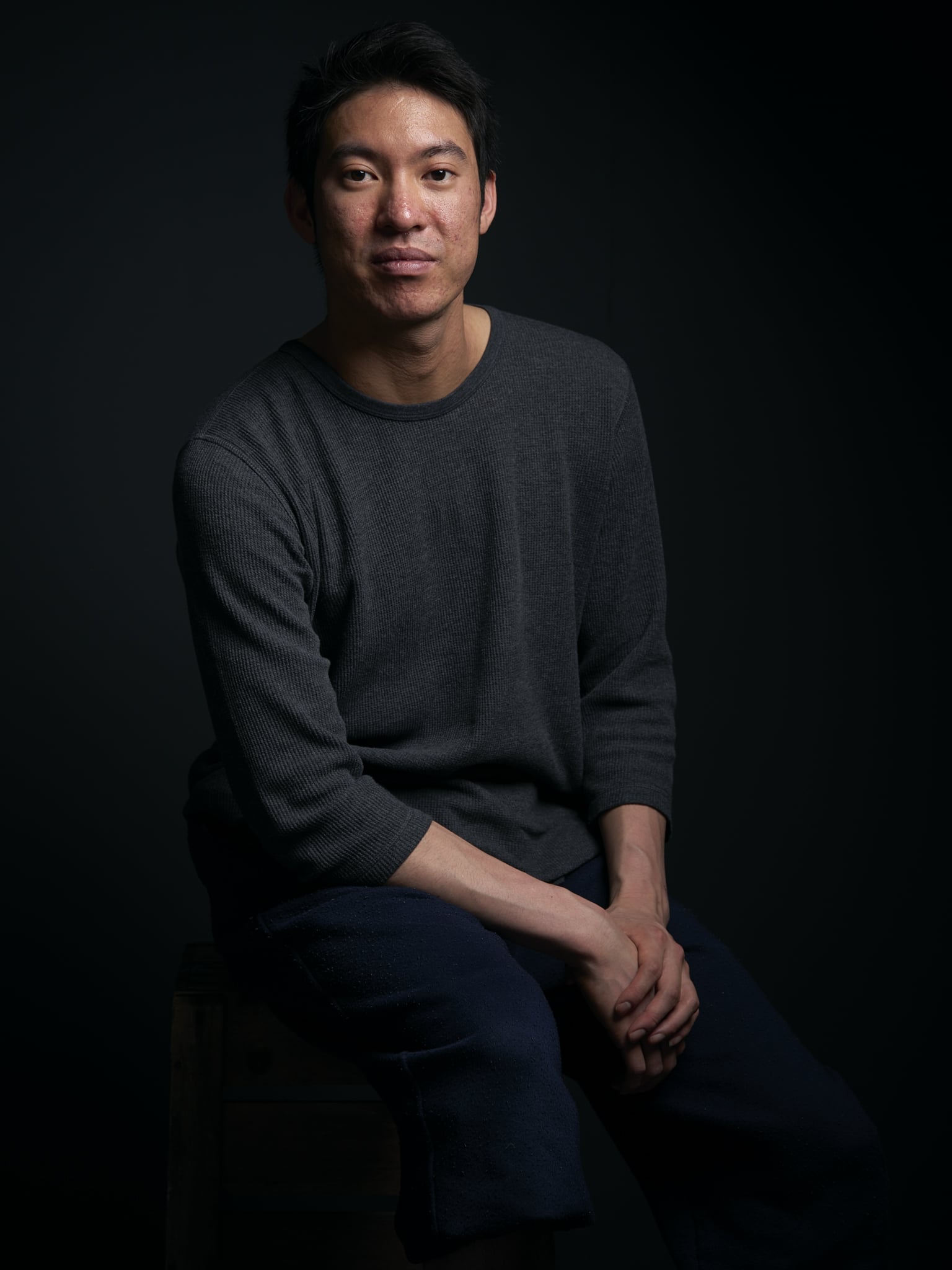
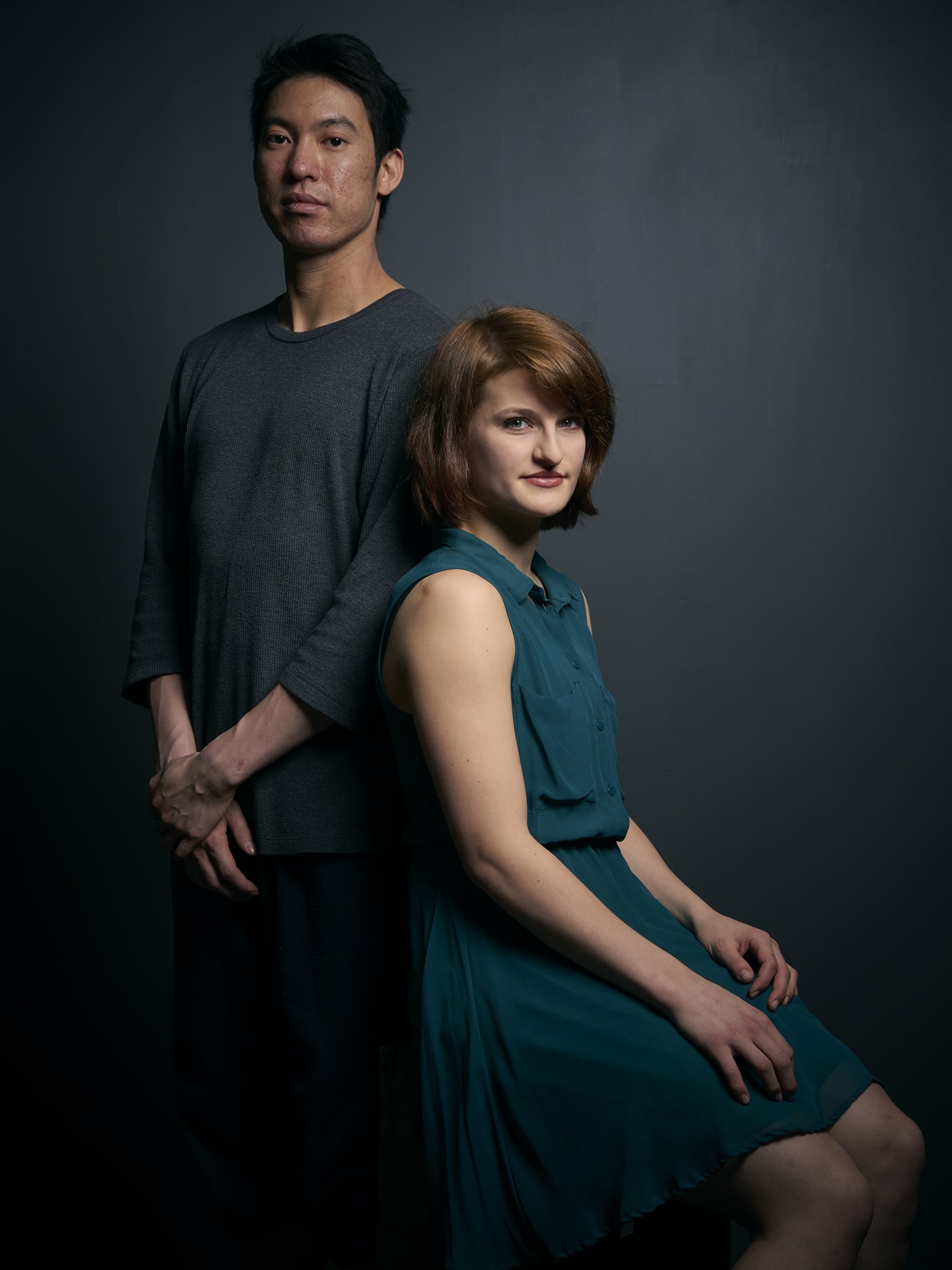
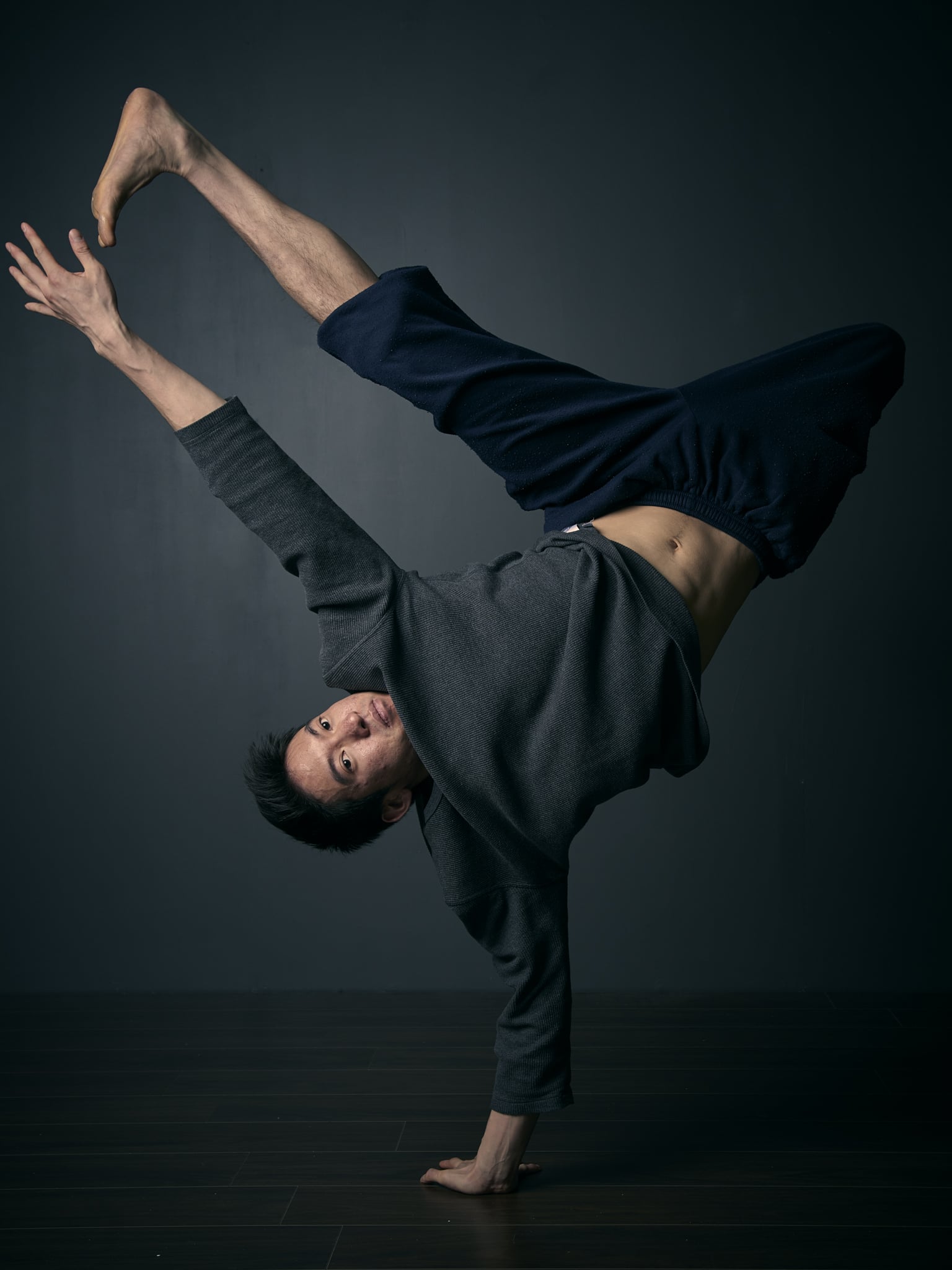
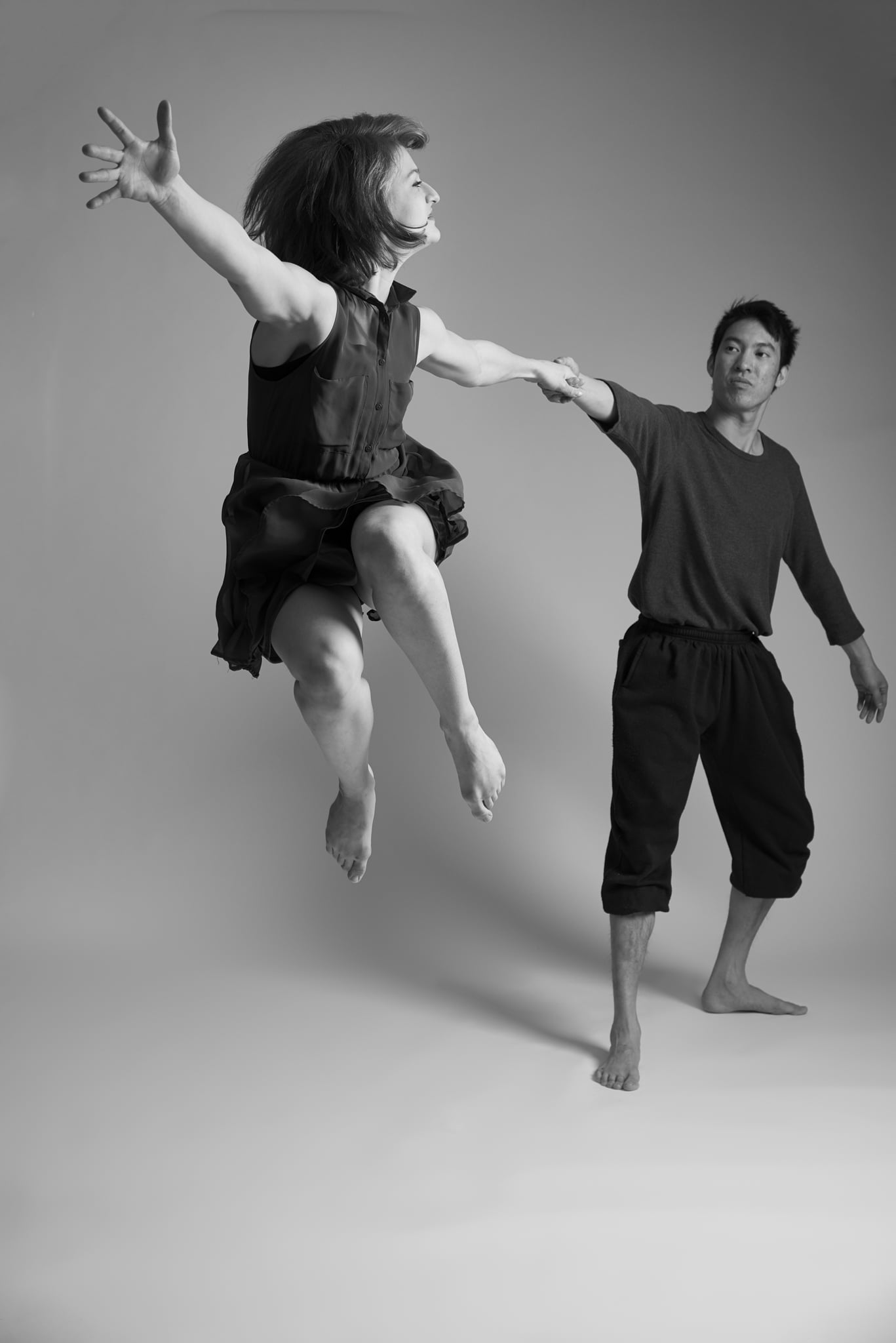
Alle photo's where made with the Nikon D800 with the Sigma 24-105 art lens.
Leica Test Drive: Leica M (Type 240)
A few weeks ago Leica announced the Leica test drive. I have always been interested in Leica camera's, but never wanted to invest in it before I could test it. So the Leica test drive was the chance to test out a Leica in a real world situation. So I organised a photohoot to test it out and used it on 2 commercial jobs in the same weekend.
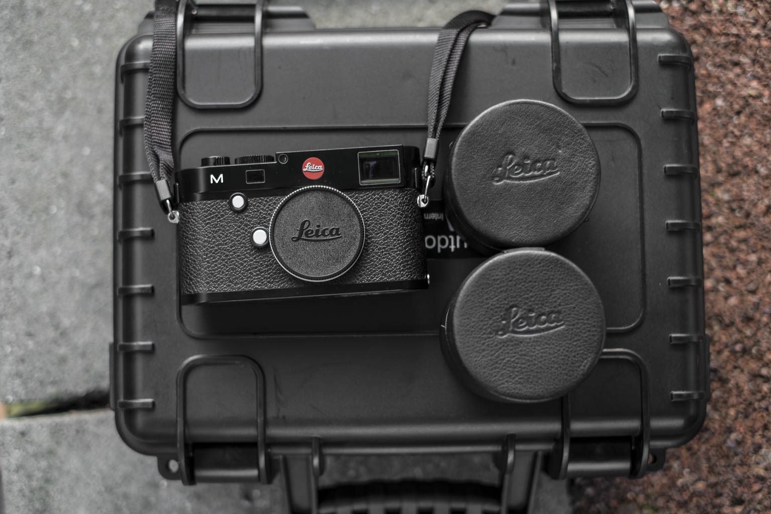
The Leica M (type 240) Kit
In the Leica test drive kit was the
- Leica M (type 240)
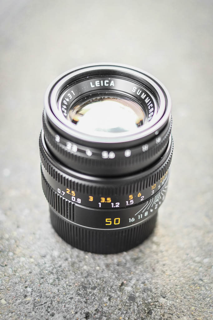
- Leica Summicron 50mm F2.0 ASPH
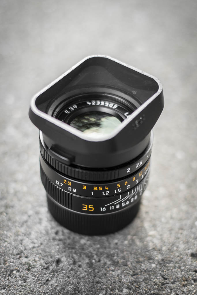
- Leica Summicron 35mm F2.0
- Leiva EVF2 Electronic Viewfinder
- Charger
- Card reader
- Case
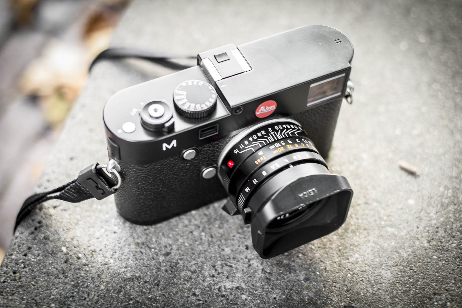
First Look at the Leica M.
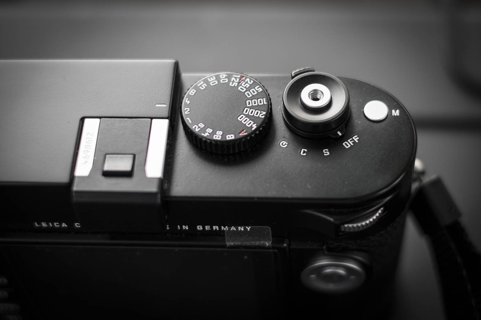
The first thing you notice when you hold a Leica is the build quality. These camera's are build like a tank. They don't look ergonomically, but are very pleasant to hold. The further lay-out is really simple. On top is the shutter time and release button, with the on/off switch. With the on/off switch you can also chance from, single to continuous or timer mode. Also there is a small button voor Movie mode which I haven't used. The Hotshoe has a nice slider to fill it up when it isn't in use.
The back panel has a kind of okay LCD screen, the buttons for LV (LiveView), Play(back),Delete, ISO, Menu, set. On the right side is the D-pad with an info button. At your thumb is a wheel for different tasks, like scrolling the menu and exposure compensation. The viewfinder has a small ring without a diopter, which for me as a glass wearing person wasn't the most comfortable.
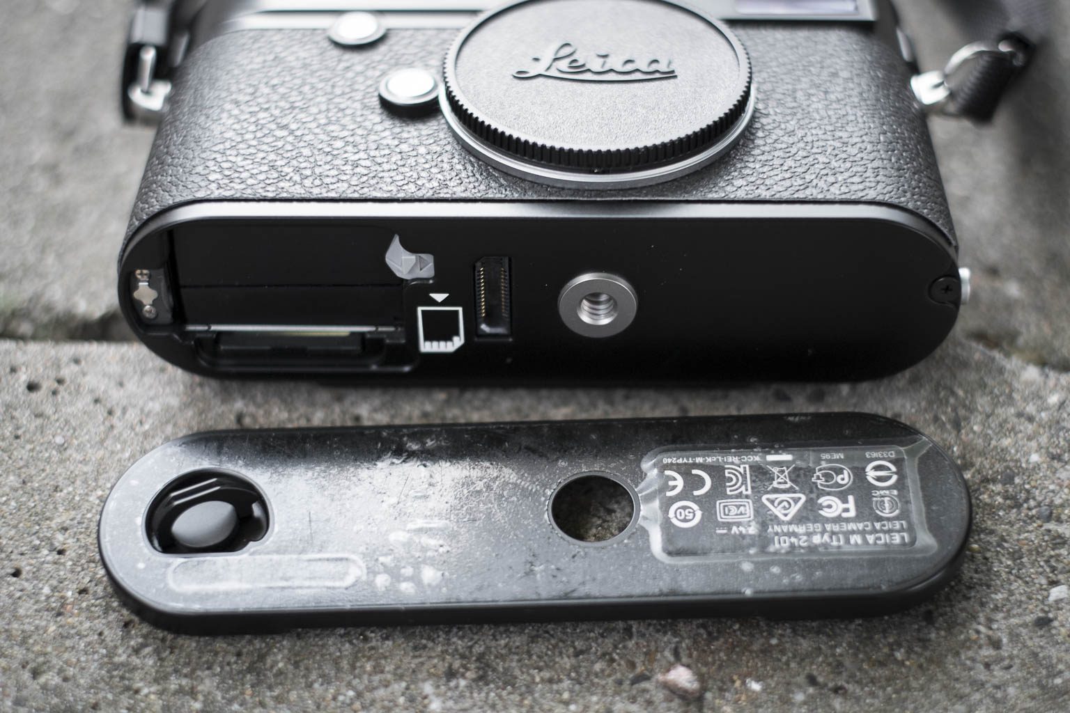
If you unlock the bottom plate you get acces to the SD card and the battery. I am not really fond with this, especially when you want to use it with a tripod. Then you have to unscrew everything before you can change the battery or the SD card.
The Leica Summicron 35
The Leica Summicron 35mm f2.0 is delivered in a greatly designed leather softcase. It had a rubbercap to put on the lens hood for if you don't want to use the lens cap, which you can store in a special part of the lens softcase. The little grip makes it easy to focus with. The focus ring is smooth as butter. The aperture ring is nice but has a little bit of a cheaper feel. I have had lenses where the aperture ring felt better.
The Leica Summicron 50 f2.0 ASPH
The Leica Summicron 50mm f2.0 has the same build quality as the 35mm. I missed the little focus thingy of the 35mm! Which made focussing a little harder. For the people who don't know. This €12.000 camera kit has NO AUTO-FOCUS. But the manual focus system with the two glasses works brilliant! Because it is a range finder you get frame lines in the viewfinder representing the area that is in your frame. The 50mm is for me the longest lens to use with this. For longer lenses I would love to have the Hybrid Viewfinder like the Fuji X-Pro1 has. But for working with the Leica Summicron 50mm is good enough!
The Photoshoot
To really test the camera I organized a small photoshoot. I had a lovely Ballerina (Charlotte Geeraerts, two assistants (Mike Foto and Riet Verwoert), a person who filmed it (Ilse van Gemert) and my MUAH Elvira Korten (Made of Make up). For location I rented the Metaal Kathedraal in Utrecht. A behind the scenes video is posted at the end of this blog!
The Images
The most important thing off any camera, the images!
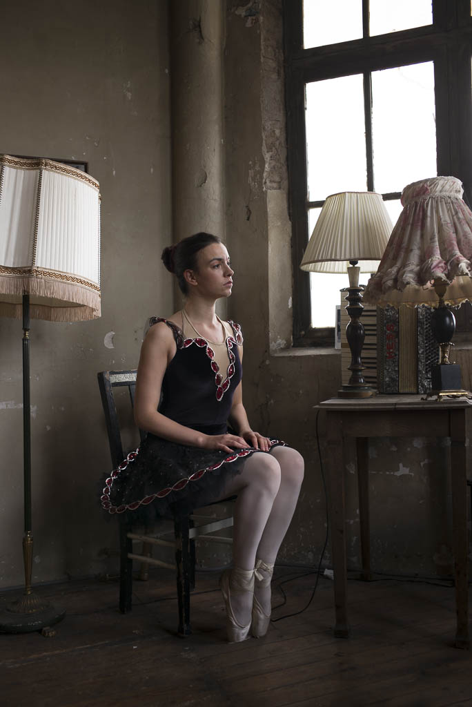
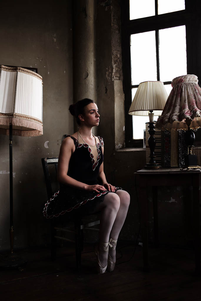
The Leica M has some film simulation. I liked the smooth color the most. It has the "Add the red chanel for contrast" in photoshop look. On the back of the camera it looked great but on the computer the shadows where to dark. Since I always shoot Jpeg+Raw (DNG in de case with Leica) there was nothing to worry about. Below are two images, one is the Jpeg and the other the raw file exported from Lightroom as a Jpeg.
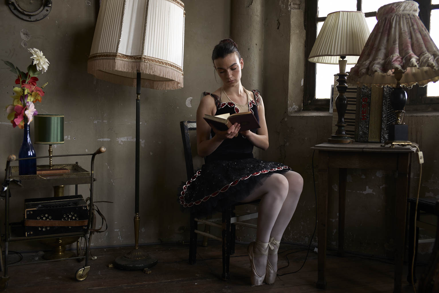
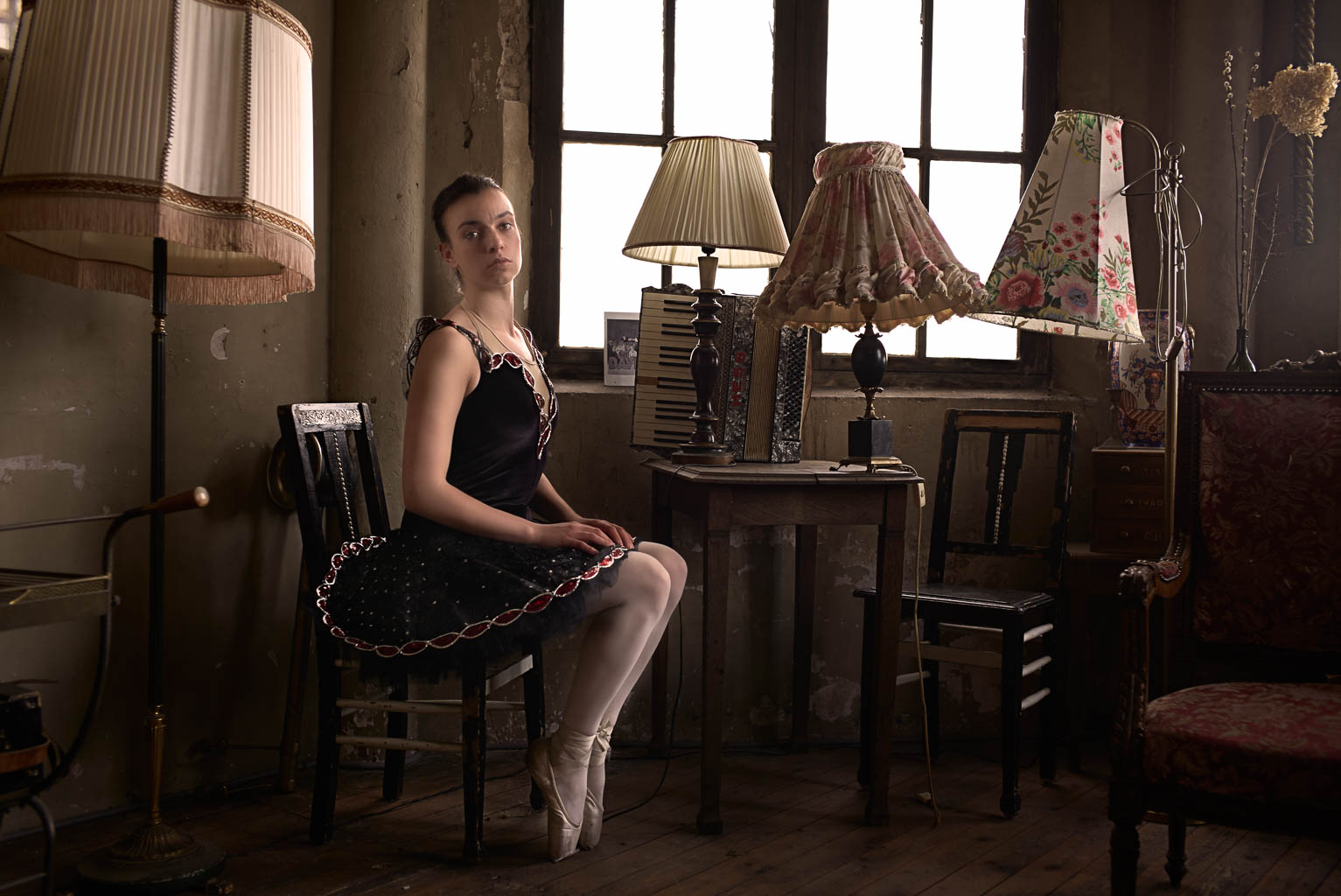
For me the camera worked best in available light. Below are 3 pictures shot only with the ambient window light. Please also notice how much of a difference you can make with just walking around the model!
When I combined flash with natural light the white balance got it pretty right!
Conclusion
I loved working with the Leica M (type 240) with the Summicron 50mm f2.0 ASPH and Summicron 35mm f2.0! Allthough it is manual focussing, it works. The layout of the camera is simple. Everything you need, nothing you don't with a build like a tank body. Everything feels sturdy!
But, is it worth the €12.000 price tag? Well..... for me it's not. That doesn't mean I wouldn't like to have this camera kit, because I really do! But the price is to high for me. I don't see the extra benefit's over my current kit with the Nikon D800 and D610, and my fuji kit. I love the whole feel and look and way of working, but the image quality isn't like, 6 times better than the €2000,- Nikon D610 basic kit.
If I was a fulltime street or reportage photographer this camera would fit like a glove, it is low profile, light, portable. Also for fashion or commercial works it can do the job. It isn't an action camera. Although if you know your technique you can do it!
So my final conclusion. The camera is great, if you have the money, buy it! If you don't, then you don't miss anything. The camera is a tool, the photographers make the difference!
Watch the behind the scenes video of the ballet photoshoot in the Metaal Kathedraal
DANCE PHOTOGRAPHY SESSION PART 2: The group shot on the wall
Hi and welcome to the second part of the Dance photography session. This serie is about a commercial dance photography shoot I did for Djenz Factory. If you didn't have read the first part about the Headshot, click here and read about it: DANCE PHOTOGRAPHY SESSION PART 1: THE HEADSHOTS.
The set-up
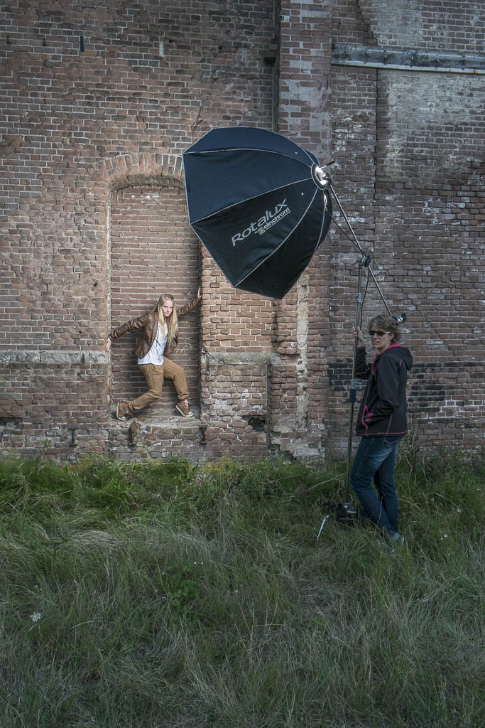
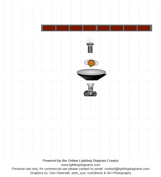
As you can see in the test production photo the whole set-up was just one light! The Elinchrom Rander RX Quadra, with an A-head in the A-port for the biggest blast of light. Everything was mounted on a C-Stand with three sandbags and my assistent holding it. It went up for the maximum height, and I didn't want to take any risk of it tipping over. The camera was the X-Pro1(ISO:200, 1/125th, f8) with the Fujinon 18-55 2.8 - 4 lens at 18mm.
Post-production
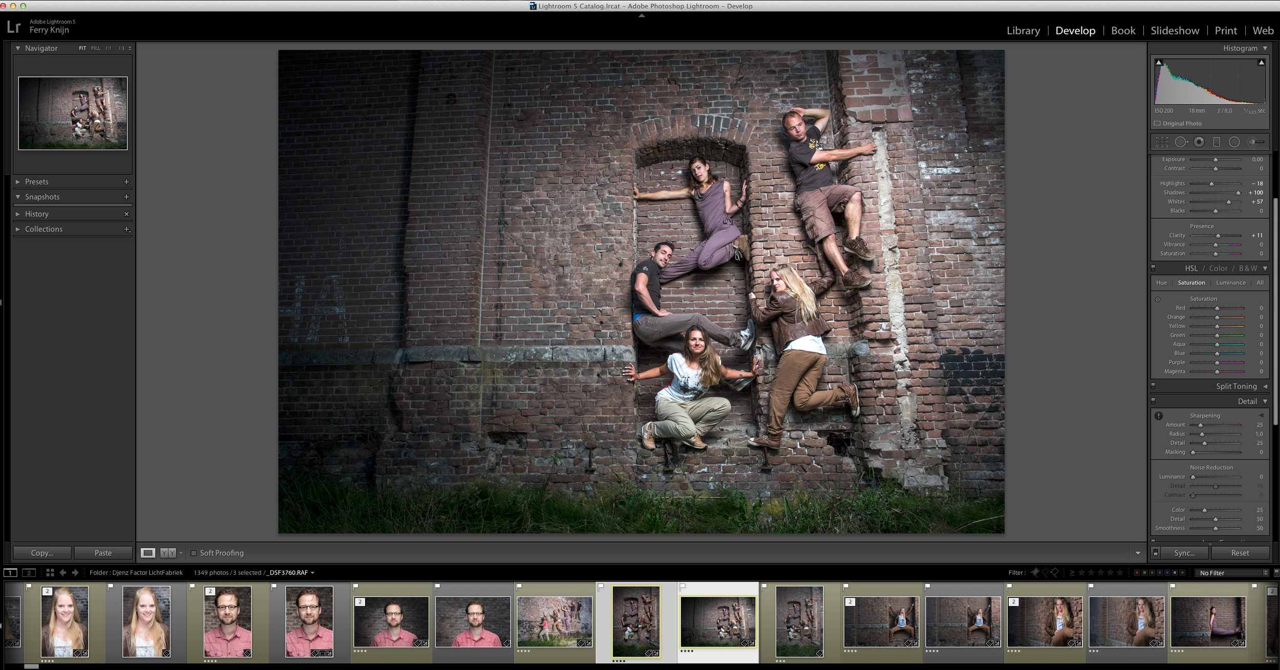
Because this was a group shot on a 16mp camera I kept the post production very simple. These shots are about the group, not about retouching every skin detail. And for doing that, there was not enough information to make the skin look better. So I just focused on getting the mood. So all I did were some basic Lightroom touches. Just some sharpening, highlight, shadows, and a vignette to focus the view on the group.
Shooting portrait and landscape
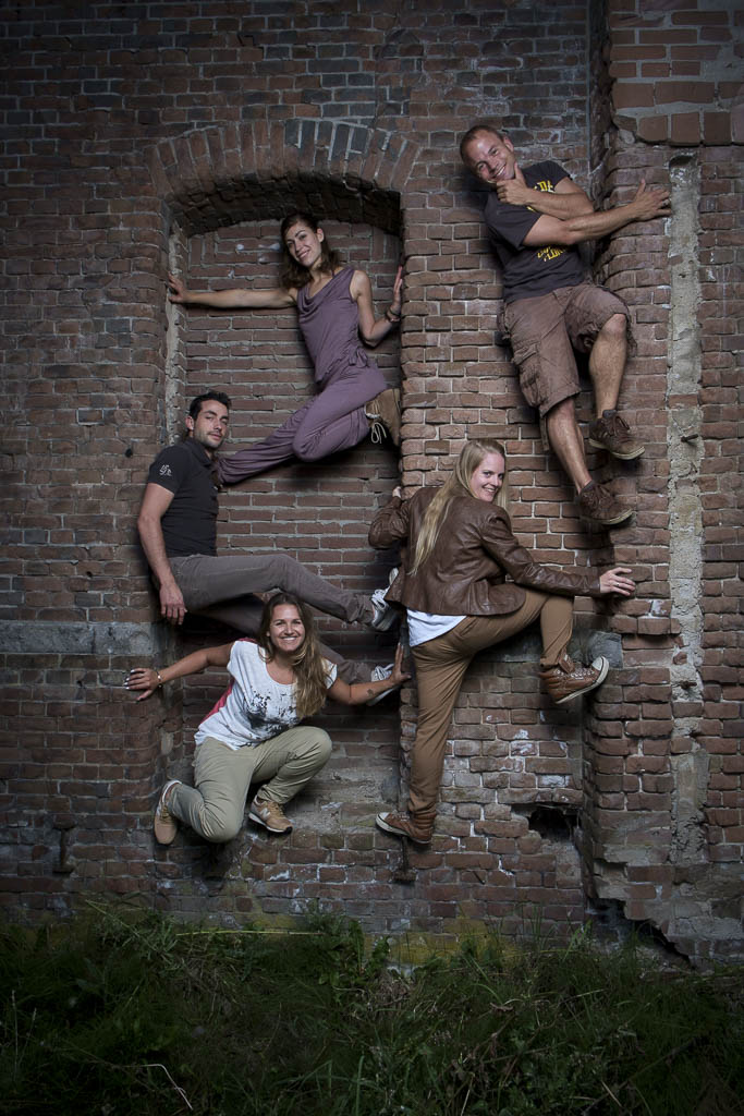
Remember always to also shoot and deliver a Portrait and a Landscape version of the photo. This way your client has the option to choose and have the highest quality for the way they want to use it.
Dance photography session Part 1: The headshots
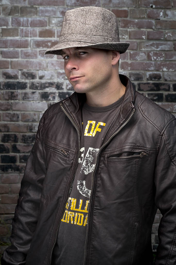
In the upcoming blogs I am going to take you through the process of a dance photography shoot. A few weeks a go I got the call from Djenz Factor that they needed new promotional photo's for their new website. Having worked with them multiple times before I knew this was going to be fun! For location we have been to the area of the Lichtfabriek in Haarlem. Because that is where the new dance studio is going to be. We wanted to start with an outside session. It is in an old industrial area so it is really nice. The only thing that was looking to be a problem was the weather, but it was great weather that evening! We started with the head shots of the creative team
The Set up
For the Headshots I used a fairly basic setup. On the location we found this lovely brick wall to use as a background. For the lighting I used my Elinchrom Quadra set with A heads. The main light was in the A port with the 100 Rotalux octa soft box. I Also placed a second light on the background, that was in the B port with the Elinchrom 18cm reflector and grid, so it had a little bit of a natural vignette. To have a little bit of fill I used a silver reflector handheld by my assistant. For camera I was using the Fuji X-pro1 with the Fuji 56mm 1.2 lens. I was really happy to use it for the first time on a job. Setting were: raw+jpeg fine, F10, 1/125 ISO 100.
Going to Post
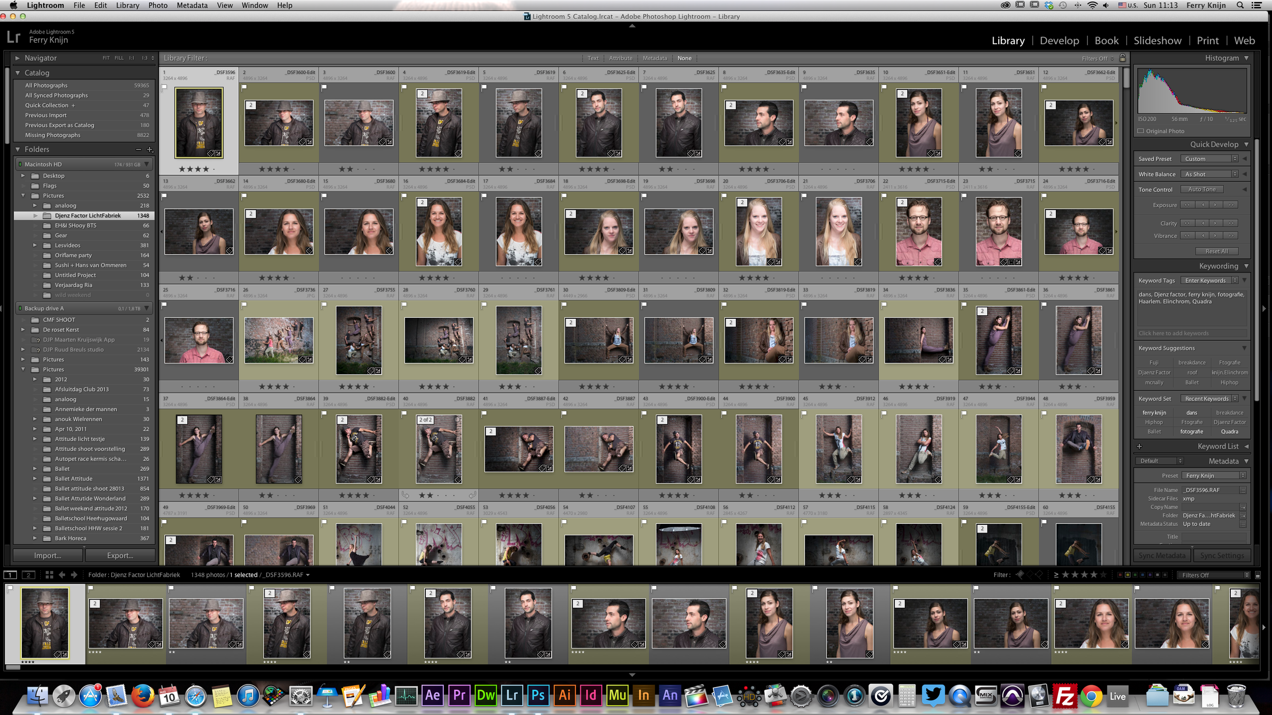
When I first opened the files in Lightroom I was really impressed by the jpegs of the camera. They where so good that I even have delivered some pure jpeg's to my clients. I also noticed that the Lightroom Fuji profiles are still of and not matching enough for my taste. For post I really have speeded up my workflow. In the past I was using Nik Color Efex pro a lot, but the loading time was getting to long for me. When I just have to do a few pictures it is no problem, but when you have to do around 50, it is too long. So I have started to create some actions to speed everything up.
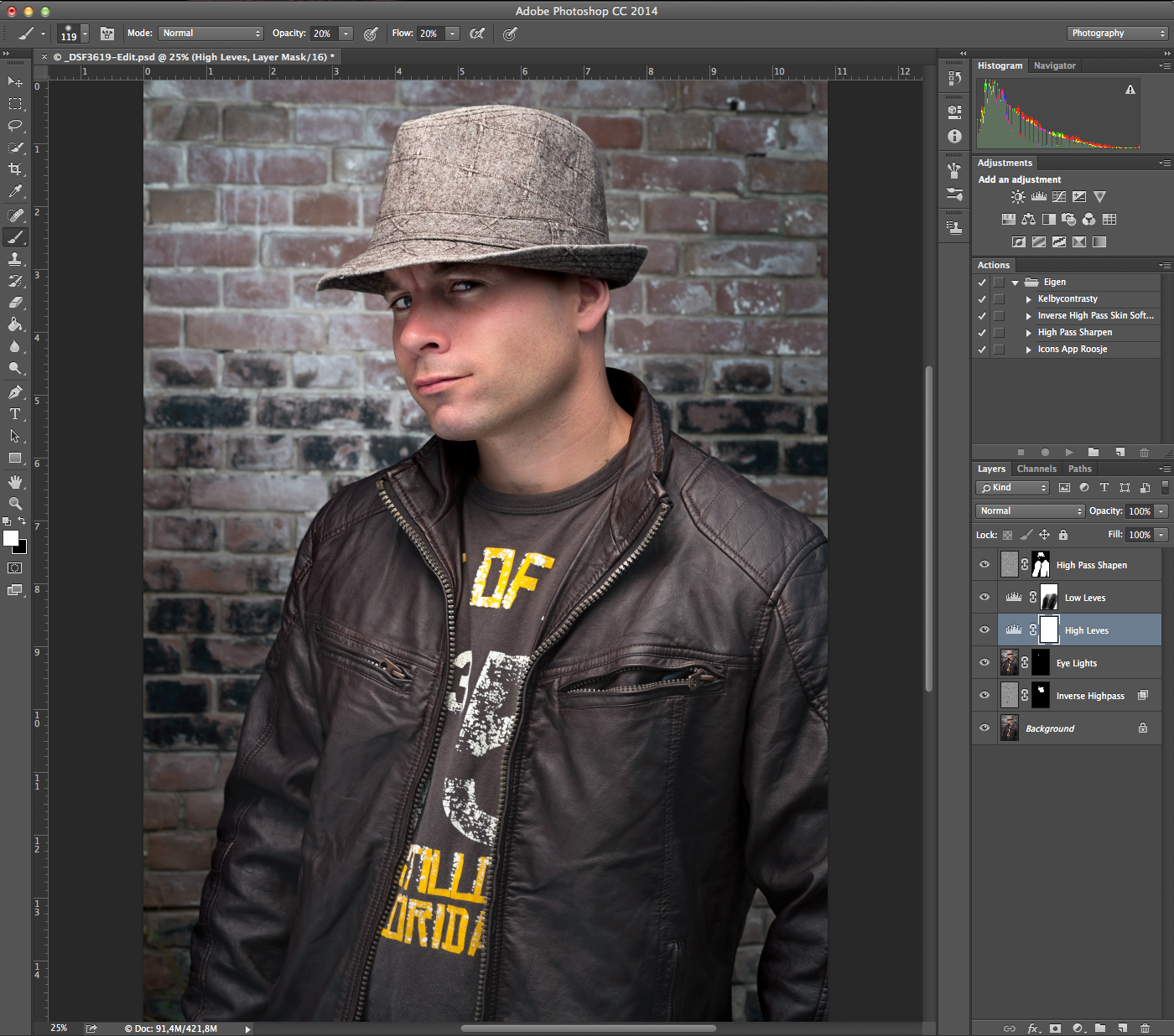
I first started to remove some of the basic blemishes with the healing brush. After that I used the Inverse High pass skin softening action. Which is based on a technique I learned from Scott Kelby on KelbyOne. It gives a nice skin in just a few seconds. After the skin was done I wanted to make the eyes pop a little more. So I created another layer, set it to screen and hidden it with a layer mask. Than used a brush to reveal it on the eyes and used the opacity to make it look more natural. To add a little more contrast I made two level adjustments and painted them in the Layer masks. To finish it off used the High Pass filter to give it a little more sharpness on some areas.
Done
And that was all I did. If you have any questions post a reaction down below!


